Designing the interface for Voice-First Clinical AI.
How we built the brand identity and digital home for the UK's most advanced ADHD and Autism AI platform: cerebric.io
The Challenge: A "Black Box" of Brilliance
"They had the engine. We needed to build the bodywork."
When Cerebric approached us, they had already achieved something remarkable: they had built a fully functional, high-performance AI platform capable of automating complex neurodevelopmental workflows. The technology was verified, compliant, and ready for the NHS.
However, the brand didn't match the brilliance of the build.
Their existing presence was functional but felt engineered rather than designed. It spoke the language of databases and algorithms, not the language of clinicians and patient care. In a sector dominated by trust—where "Right to Choose" providers need to feel established and safe—Cerebric looked like a tech experiment, not a clinical partner.
The Approach: Branding "The Future of Care"
"Designing for the space between Silicon Valley and the NHS."
We started by defining the visual identity. The goal was to avoid the cold, sterile tropes of standard AI startups while steering clear of the dated aesthetic often found in healthcare legacy software.
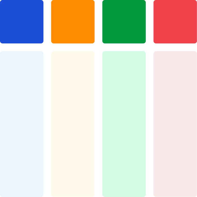
The Palette
We moved away from generic "tech blue." We selected a sophisticated palette that uses deep, trustworthy navies grounded by clinical whites and soft greys, punctuated by a vibrant "pulse" colour to signify the active intelligence of the AI.

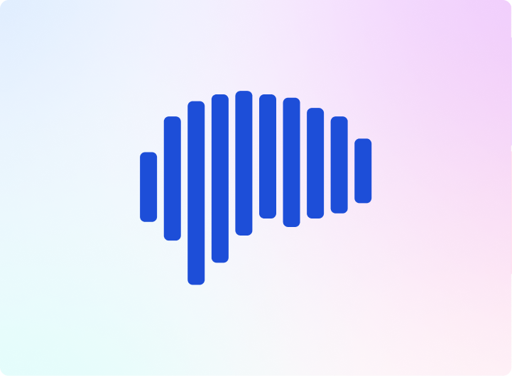
The Logo
We crafted a mark that symbolizes connection and clarity—representing the "cerebral" nature of the product while feeling approachable.
Typography
We chose a typeface that offers high readability (crucial for medical contexts) but retains a modern, geometric geometry. It says "evidence-based," not just "typed."
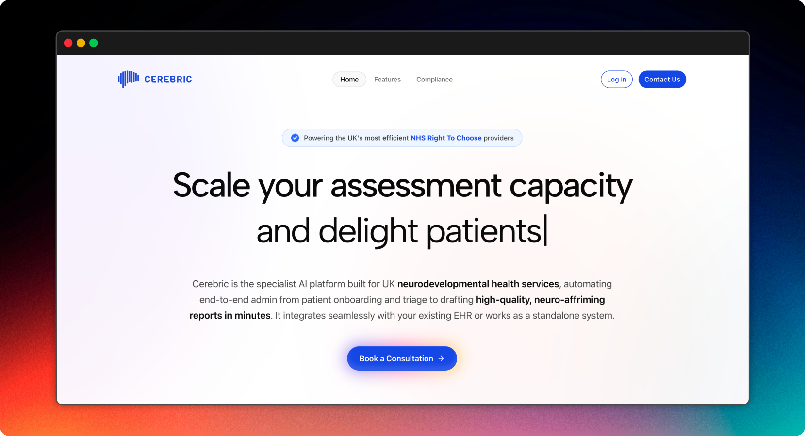
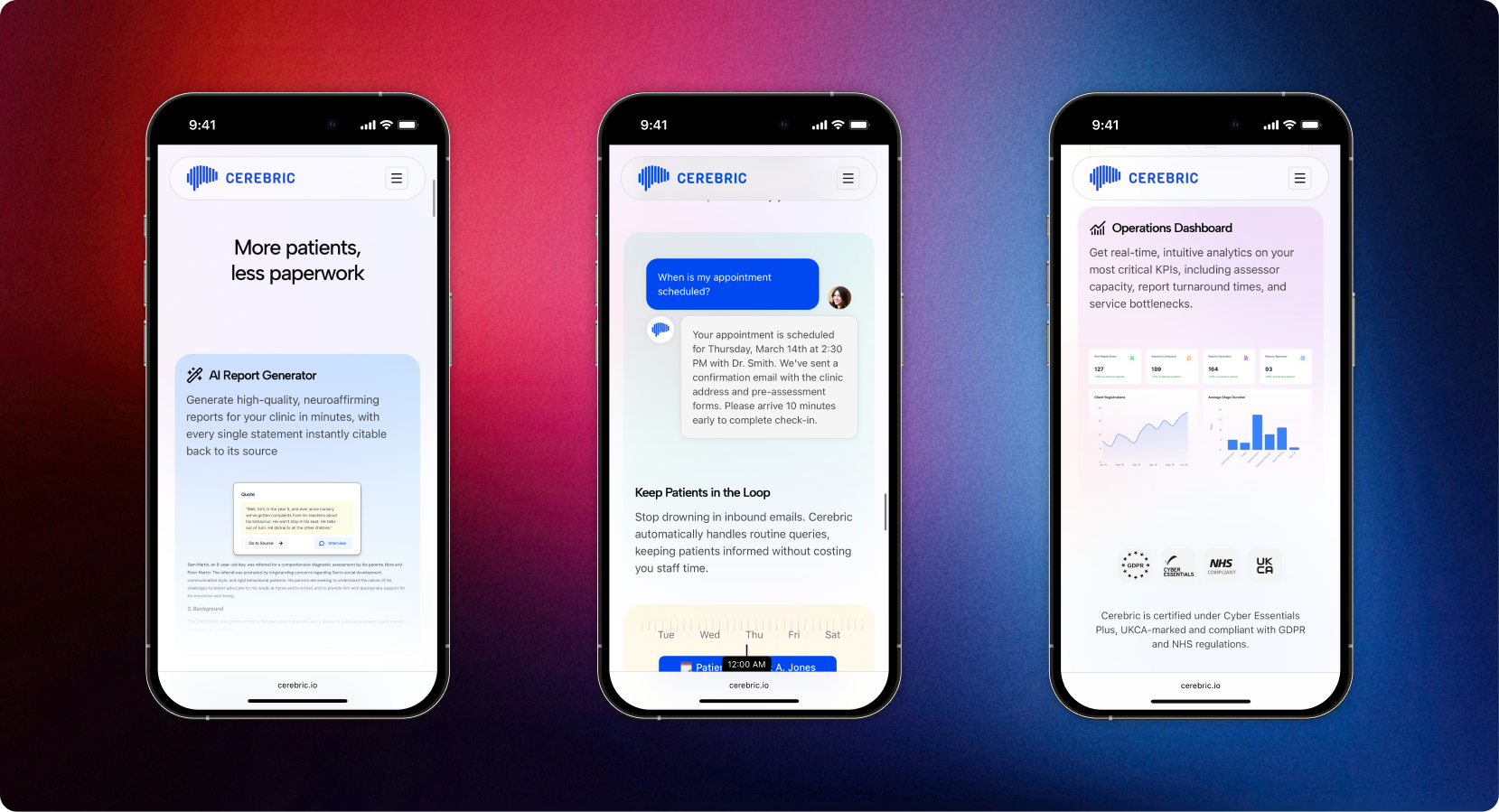
Zero-Latency Trust
We translated the identity system into a high-performance marketing site. Built on Next.js for instant load times on hospital networks.